
MAIN MENU UX
ADVANCED / LEAD UX DESIGNER | SMITE 2
PROBLEM STATEMENT
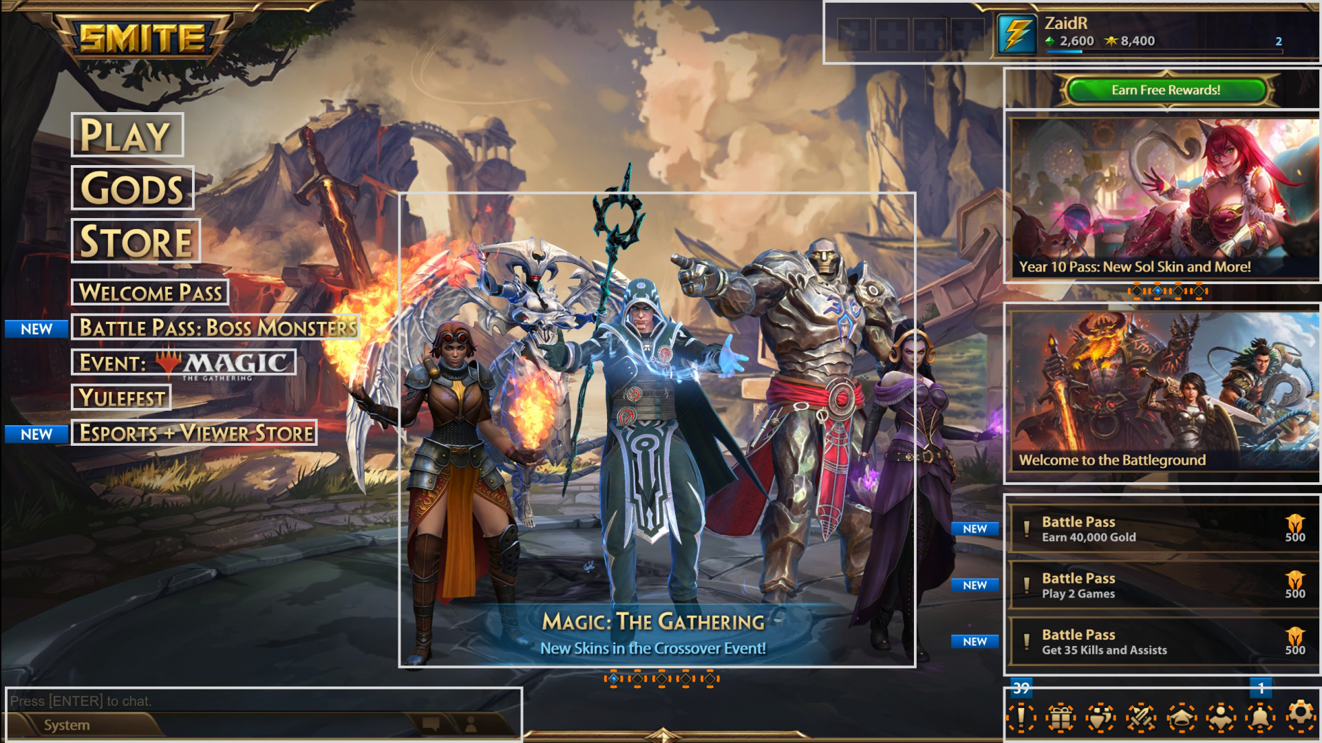
The SMITE 1 Main Menu presents a large amount of information to the player base, potentially overwhelming players of all skill levels. This cognitive overload risks creating higher negative impacts on players who have spent less time with the game. The SMITE 1 Main Menu typically offers 8-9 options in its list, sometimes exceeding 10 during a season. Currently, depending on an individuals interpretation of this screen, it offers somewhere between 16 to 30 potential interactions which is objectively too much for a single screen.
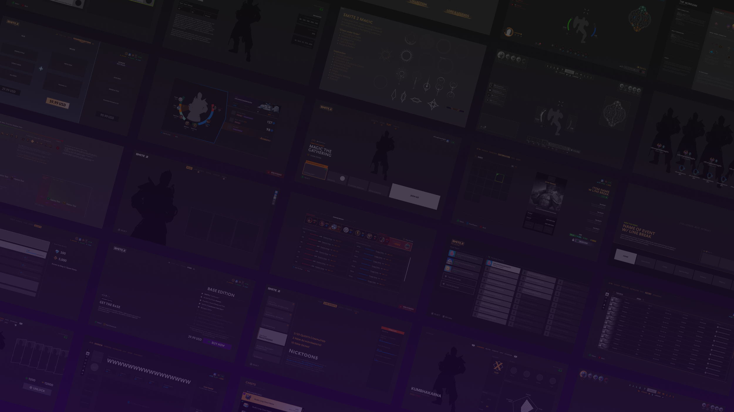
SMITE 1 Main Menu from March 2023 The white boxes identify primary interactions, while the orange dashed circle offer additional interactions that can lead to new screens, or new visuals within this screen through pagination.
SOLUTION
With modern games becoming more complex, syncing with our community, and understanding how the current layout offends many common psychological ideals, we need to look into creating an organized division of the layout. The addition of a tab menu allows us to organize the Main Menu in such a way that gives players more control in what they’re viewing as oppose of seeing everything on the screen simultaneously. In order to achieve this, it’s highly recommended we seek out feedback from our community. Without direct feedback, we rely on assumptions and limited telemetry data to guide our decisions. In speaking with SMITE 2 stakeholders, and many community members on our Discord servers, I ran a card sorting exercise with both groups on how the layout could be created. The wireframes below are the result of these exercises.
STAKEHOLDER NOTES
List menu navigation.
3D skins in center screen; critical selling point for the product.
Space for a JSON ad.
Flexible: Open to the ides of a tab menu design
Events or Promo Presentation: Each event/promo needs to have the flexibility of having unique layouts.
Note: On average, there are 1-3 events running concurrently, but there have been many times where this number has been exceeded, not including the battle passes. Must have requirement:
UX GOALS
Provide a less complex, and more intuitive experience for players, of all experience levels, when navigating the Main Menu.
Focus on providing players with a clear understanding of what’s available to them at the highest level without potentially creating an inundating experience.
Ensure any and all layout changes are easy for experienced SMITE 1 players to understand who may potentially be expecting the current SMITE 1 layout.
Create an alternate instance of the Main Menu for first-time players to hopefully reduce the feeling of complexity when they’re trying to navigate through the front-end experience.
HOME SCREEN (NEW)
This redesigned Home Screen provides a streamlined, high-level navigation experience with increased space for showcasing new cosmetics. It minimizes initial interaction costs by distilling the SMITE 1 front-end layout to essential navigation elements.
Beyond this point, the full game becomes accessible, with content organized through a tab-based layout, giving both players and the development team greater control over individual experiences. Selecting an option on this screen deep-links the user directly to the relevant content—for example, choosing "Gods" navigates to the Gods screen, and selecting a store item takes the player to that item’s page within the store. For the purposes of this presentation, we’ll assume the player selects "Play."
Upon selecting "Play," the player lands on this screen. A tab menu at the top mirrors the previous layout’s list menu, with "Play" as the default experience, reflecting its importance as the core reason players engage with the game. It’s positioned prominently, alongside other key game areas. This screen offers a focused set of play options, guiding players to their preferred match types. The background highlights relevant promos and events tied to the selected mode—e.g., Competitive-only events won’t appear under Quickplay. A summary of event progress is also displayed, with an option to view detailed event information.
For clarity:
Quickplay: Exhibition matches
Competitive: Ranked match types that count towards your seasonal progress
Custom Matches: Private matches set by the player
Match Training: Practice sessions for new players defined by Titan Forge
Basics: Glossary, VGS breakdown, and tutorial videos
PLAY MENU (NEW)
GODS ROSTER (UPDATED)
The God Menu helps players explore and learn about the gods they play or want to try. While deeper customization options exist beyond this screen, its primary function is to provide clear visibility into which gods are permanently unlocked, temporarily available, locked, or disabled (rare). Filters allow players to narrow results by playstyle, pantheon, ownership status, and more. In the future, we aim to introduce a version with headshot-style thumbnails to display more gods at once.
EVENTS (NEW)
In SMITE 1, all events are presented directly on the Main Menu, which quickly clutters the layout and offers very little context. Players are often forced to dig through multiple menus just to understand what an event actually is. The intent behind this change is to reduce that friction and deliver event information in a clearer, more digestible format. By giving events their own dedicated screen, the content team gains the flexibility to add as many promotions or limited-time events as needed, since vertical lists scale much more cleanly.
That said, this approach isn’t without risks. A long, unfiltered list of events could overwhelm players or introduce potential performance issues if not handled carefully. In SMITE 1, even adding 5–7 events to the Main Menu already felt like too much. A streamlined layout helps us avoid that, while still surfacing high-level progress at a glance, removing the need for players to constantly dive into dense, layered UI.
Because each event or partnership is often built around unique visual and functional requirements, this structure also allows us to maintain a consistent presentation style. That consistency makes it easier for players to recognize what’s available and track their progress, regardless of how complex or simple the event might be.
STORE (REDESIGNED)
This layout was primarily developed in collaboration with SMITE’s Monetization Lead, Taylor Sloan, during a series of weekly one-hour syncs. Together, we explored various concepts that culminated in this final design. Key requirements included prioritizing product order (DLC, Chests, Bundles, Skins, and Miscellaneous) and creating a flexible store capable of displaying limited inventory or a full product range.
The main challenge was to highlight new items, popular products, and custom offers tailored to player engagement amidst the broader inventory. Our solution was to design a high-level screen that emphasizes these offer types while allowing access to additional products within specific categories. I elaborate on this further in the Store section of the SMITE 2 page.
Additionally, stakeholders expressed a desire to display all skins in 3D, but due to technical limitations, we could not implement this within the available timeframe. While this feature is currently on hold, it remains a long-term goal.
TRIALS / QUESTS (NEW)
This layout is a new way of presenting quests. In SMITE 1, quests were presented in multiple ways throughout the front end experience. Additionally, events and promos introduced more unique ways of providing players with new objectives. The intent here is to have a centralized location for each quest type that players can manage in one place with one method of presentation.
RETURNOTHER UX DESIGNS